


When selecting fonts for email typography, prioritize readability and clarity. Use clean sans-serif fonts for digital content, ensuring they align with your brand’s voice and audience preferences. Stick to a minimum of 14px for body text to enhance legibility and maintain consistent styles throughout your emails. High contrast between text and background improves visibility, while simplicity can capture attention. If you’re looking for more tips to enhance your email design, there’s much more to explore.
Table of Contents
Key Takeaways
- Choose sans-serif fonts for digital content to enhance readability and clarity on screens.
- Maintain a minimum font size of 14px to ensure comfort and legibility for all users.
- Use high contrast between text and background to improve visibility and reduce strain.
- Limit the number of font styles to two complementary options for visual harmony and consistency.
- Conduct A/B testing across devices to optimize font styles, sizes, and overall engagement.
Understanding the Importance of Typography in Emails
Have you ever considered how the font you choose for your emails impacts your message? The psychological effects of typography can’t be ignored. Fonts convey emotions and influence how your recipients perceive your content. By selecting a professional font, you not only enhance readability but also align with global standards that audiences expect. A clean, modern typeface can boost your credibility, while an overly decorative font might distract from your message. You want your readers to focus on your words, not struggle with deciphering your style. So, take a moment to reflect on the fonts you use; they play a vital role in effective communication and can greatly shape your audience’s response. Don’t underestimate the power of typography!
Choosing the Right Font for Your Audience
When picking a font for your emails, you need to take into account your audience’s preferences.
Think about their age and demographics, as these factors can influence what they’ll find appealing.
Plus, make sure the font aligns with your brand voice to create a cohesive experience.
Understand Audience Preferences
How can you guarantee your email resonates with your audience?
Understanding their preferences is key.
By leveraging audience surveys and monitoring preference trends, you can choose fonts that align with their tastes.
Here are some factors to keep in mind:
- Professionalism: Use clean, modern fonts for corporate audiences.
- Readability: Opt for sans-serif fonts for digital content.
- Personality: Match the font style to your brand’s voice.
- Cultural Sensitivity: Be aware of cultural associations with certain fonts.
- Accessibility: Make sure the font is legible for all readers.
Consider Age and Demographics
What font choices best connect with different age groups?
Understanding demographic shifts is essential when selecting fonts for your emails.
For younger audiences, modern and sans-serif fonts like Arial or Roboto resonate well, offering a clean and contemporary feel.
In contrast, older generations might prefer serif fonts such as Times New Roman or Georgia, as these evoke feelings of familiarity and tradition.
Don’t fall into age stereotypes; remember that preferences can vary widely even within age groups.
Test different fonts to see what works best for your audience.
Ultimately, your goal is to enhance readability while making your message relatable.
Align With Brand Voice
Does your font choice truly reflect your brand’s voice?
Guaranteeing voice integration is essential for achieving brand harmony.
The right font can create a strong connection with your audience, so choose wisely.
Consider these factors when selecting your font:
- Target audience: Understand their preferences and expectations.
- Brand personality: Match the font style with your brand’s character.
- Readability: Guarantee your font is easy to read across devices.
- Emotional impact: Choose fonts that evoke the desired feelings.
- Consistency: Maintain uniformity across all communications.
Font Styles: Serif vs. Sans Serif
When choosing a font for your email, it’s essential to understand the differences between serif and sans serif styles.
Serif fonts have distinct characteristics that can convey tradition and formality, while sans serif fonts offer a clean and modern look.
Knowing when to use each style can enhance your message and improve readability.
Serif Font Characteristics
Serif fonts, with their distinctive strokes and embellishments at the ends of letters, provide a classic and traditional aesthetic that many find appealing.
Their historical uses date back to ancient manuscripts, and they often evoke a sense of formality and trust.
When considering serif fonts for your emails, keep in mind the following characteristics:
- Enhance readability in printed materials
- Create a warm and inviting tone
- Offer ornamental serif designs that add elegance
- Provide a sense of stability and tradition
- Suitable for formal communication
These qualities make serif fonts a solid choice, especially when you want to convey professionalism and a personal touch in your emails.
Sans Serif Advantages
Sans serif fonts offer a modern and clean appearance that many find appealing for digital communication. Their minimalist appeal enhances readability, making them perfect for emails and other online content. When you use sans serif fonts, you benefit from improved screen clarity, ensuring your message is easy to digest. The absence of decorative strokes allows your text to stand out without distraction, which is crucial in today’s fast-paced digital environment. Plus, sans serif fonts adapt well across various devices and screen sizes, maintaining legibility whether on a smartphone or desktop. This adaptability further solidifies their status as a go-to choice for professionals looking to convey information clearly and effectively. Ultimately, embracing sans serif can elevate your email communication.
Choosing the Right Style
How can you decide between serif and sans serif fonts for your emails?
Your choice can impact readability and the overall theme selection.
Consider these factors when making your decision:
- Target audience: Know who you’re writing for.
- Email purpose: Match the font style to the email’s intent.
- Brand identity: Maintain consistency with your brand’s voice.
- Seasonal variations: Adapt your choice to fit the time of year.
- Readability: Prioritize fonts that are easy to read on screens.
The Role of Font Size in Readability
Choosing the right font size is essential for ensuring your email is easily readable. A font that’s too small can strain your readers’ eyes, especially on Retina Displays where sharpness can highlight readability issues.
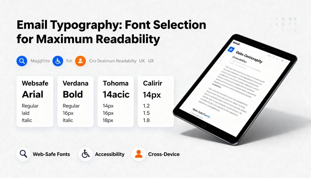
Aim for a minimum of 14px for body text to make it comfortable for most users.
Additionally, consider font scaling, which allows users to adjust sizes based on their preferences.
This flexibility enhances readability for everyone, accommodating different visual needs.
Remember, larger font sizes also improve scanning and comprehension, making it easier for your audience to grasp your message quickly.
Color and Contrast: Enhancing Your Email’s Visual Appeal
Engaging your readers starts with the right color choices and contrast in your emails.
Effective palette choices and adherence to contrast guidelines can greatly enhance your email’s visual appeal.
Here are some tips to keep in mind:
- Use high contrast between text and background for readability.
- Limit your color palette to three main colors to avoid distraction.
- Guarantee sufficient contrast for links and call-to-action buttons.
- Test your email on different devices to check color accuracy.
- Keep in mind color blindness accessibility by using patterns or textures alongside color.
Consistency Is Key: Maintaining Brand Identity
Consistency fosters brand identity, making your emails instantly recognizable to your audience.
When you choose specific fonts and stick with them, you’re not just enhancing readability; you’re also reinforcing your brand.
This identity protection helps your audience associate the style with your company, fostering trust and loyalty.
By using the same font across your emails, you create a unified look that reflects your brand’s personality.
Don’t underestimate the power of font consistency.
It’s a simple yet effective way to communicate your brand values and mission.
Remember, every email is an opportunity for brand reinforcement, so make sure your typography aligns with your overall brand strategy.
Keep it consistent, and watch your brand identity flourish in your audience’s minds.
Avoiding Common Typography Mistakes
Even with a strong brand identity, typography mistakes can undermine your efforts.
To guarantee your emails are effective, avoid these common pitfalls:
- Poor Font Pairing: Stick to two complementary fonts to maintain visual harmony.
- Inconsistent Styles: Use the same font styles throughout your email to avoid confusion.
- Excessive Ornament Usage: Limit decorative elements that distract from your message.
- Overly Small Text: Guarantee readability by using a minimum font size of 14px.
- Ignoring Line Spacing: Proper spacing enhances legibility and keeps your content inviting.
Testing and Optimizing Your Email Typography
How can you guarantee your email typography resonates with your audience?
Start by testing fonts across various devices and email clients.
This step’s essential since different platforms can display fonts differently.
Utilize optimization tools to analyze readability and engagement metrics.
For instance, A/B testing can help you determine which font styles and sizes lead to better responses.
Pay attention to line spacing and contrast as well, as these factors greatly impact readability.
Don’t hesitate to gather feedback from your audience—real insights can guide your choices.
Once you’ve identified the best-performing typography, standardize it across your emails for consistency.
This approach not only enhances your brand’s professionalism but also improves your audience’s overall experience.
Frequently Asked Questions
What Fonts Are Best for Mobile Email Readability?
For mobile email readability, use sans-serif fonts like Arial or Helvetica. Their screen adaptation guarantees superior legibility on smaller devices, making it easier for your audience to read without straining their eyes.
How Many Different Fonts Should I Use in an Email?
You shouldn’t use more than two or three fonts in an email. Mixing fonts can create design balance, but too many can overwhelm your reader. Keep it simple for clarity and engagement.
Can I Use Custom Fonts in My Emails?
You can use custom fonts in your emails, but compatibility varies. While aesthetic font choices can enhance your design, web font trends show that sticking to standard fonts guarantees better readability across all devices.
How Does Typography Affect Email Open Rates?
Typography greatly influences your email open rates. When you choose appealing fonts, you enhance perception effects and boost engagement factors, making recipients more likely to read your content and respond positively to your messages.
Are There Any Legal Issues With Font Usage in Emails?
Sure, you can just pick any font you like! But watch out for font licensing and copyright disputes; using unlicensed fonts can lead to legal troubles you didn’t see coming. Choose wisely!
Conclusion
In the world of email communication, good typography can make or break your message. Remember, “you never get a second chance to make a first impression.” By choosing the right font, size, and color, you not only enhance readability but also strengthen your brand’s identity. Stay consistent and avoid common pitfalls to guarantee your emails are engaging and effective. Take a moment to test and optimize your typography, and watch your communication improve dramatically.


