
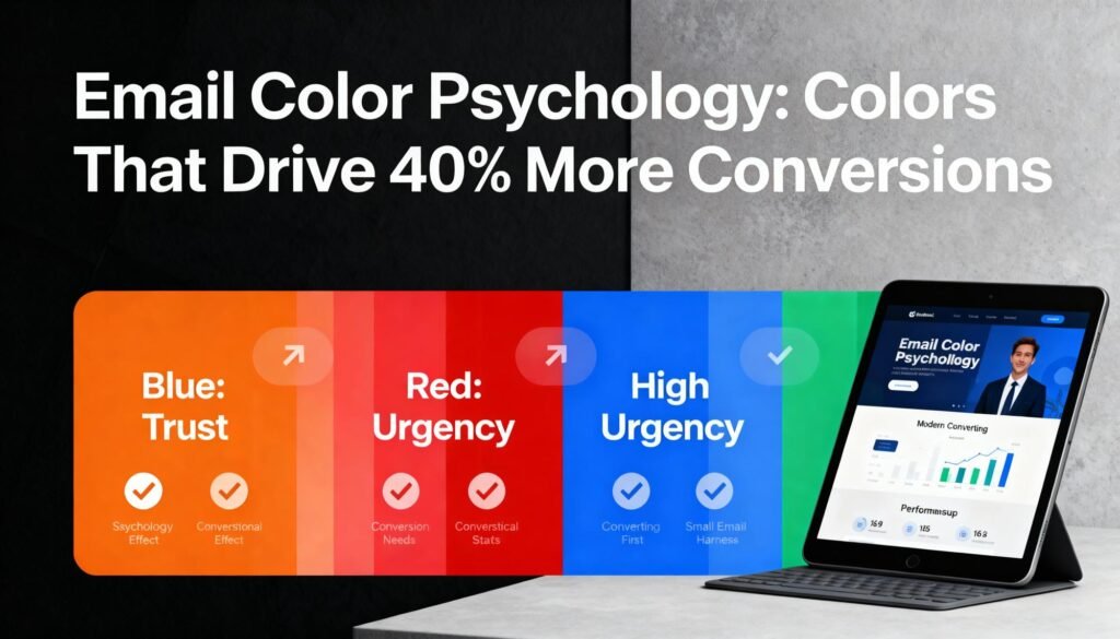


Colors in email marketing can greatly influence engagement and drive up to 40% more conversions when used strategically. For instance, blue establishes trust, while red creates urgency. Green promotes growth, and yellow sparks joy. To find the colors that resonate best with your audience, consider A/B testing your choices. Plus, keep accessibility in mind to enhance readability. Discover how to harness these insights for your campaigns and elevate your email strategy for maximum impact.
Table of Contents
Key Takeaways
- Strategic use of colors in email design can boost conversions by up to 40% through emotional engagement and brand personality alignment.
- Blue evokes trust and reliability, making it ideal for professional emails and enhancing open rates.
- Red creates a sense of urgency, effectively driving conversions for time-sensitive offers and flash sales.
- Green symbolizes growth and tranquility, appealing to eco-conscious audiences and reinforcing brand messages.
- A/B testing different colors in email campaigns helps identify which hues optimize engagement and click-through rates.
Understanding Color Psychology in Marketing
Have you ever wondered how the colors in your marketing materials impact consumer behavior?
Color branding plays a vital role in shaping perceptions and driving decisions.
The right color can evoke emotions, convey your brand’s personality, and even influence buying choices.
As you explore trend analysis, you’ll notice how certain colors resonate with target audiences.
For instance, vibrant hues may attract younger consumers, while muted tones might appeal to older demographics.
Understanding these nuances helps you tailor your marketing strategy effectively.
By leveraging color psychology, you can create compelling materials that not only capture attention but also foster brand loyalty.
The Impact of Color on Email Open Rates
Colors can trigger specific emotions and associations that influence how your audience perceives and engages with your emails.
By A/B testing different colors, you can identify what resonates best with your subscribers and boosts open rates.
Let’s explore which colors tend to perform well and why they matter.
Color Associations and Emotions
How can the colors you choose for your email influence its success?
The right hues can evoke powerful emotions and affect your audience’s decision-making. Color therapy suggests that colors can impact mood and behavior, making them essential in email marketing.
For instance, blue often conveys trust, while red can create urgency.
These color associations tap into dream associations, like green representing growth and tranquility.
When you align your email’s colors with your brand message and your audience’s emotions, you’re more likely to boost open rates and conversions.
Ultimately, the colors you select are more than just aesthetics; they’re a strategic tool to connect with your readers and inspire action.
Choose wisely, and watch your emails thrive!
A/B Testing for Colors
A/B testing can greatly enhance your email open rates by allowing you to evaluate the impact of different colors on your audience. By varying colors in your subject lines or email backgrounds, you can discover which hues resonate best.
Here’s a simple table to visualize your testing approach:
| Color Sample | Sample Size | Experiment Duration |
| Blue | 500 | 1 week |
| Red | 500 | 1 week |
| Green | 500 | 1 week |
| Yellow | 500 | 1 week |
| Purple | 500 | 1 week |
Analyze the results to see which color leads to higher open rates. This data-driven approach will help you craft more effective email campaigns.
Best Colors for Opens
Ever wondered which colors truly capture attention in your email campaigns? The right hues can greatly impact your open rates.
Using bold colors like red or orange can evoke urgency, while blue and green often convey trust and calmness.
Consider incorporating Seasonal Palettes; for instance, warm tones in autumn or cool shades in winter can resonate well with your audience during specific times of the year.
Additionally, think about Niche Strategies tailored to your market. If you’re targeting a younger demographic, vibrant and playful colors might be more effective.
Test different combinations to see what works best for your audience, and don’t underestimate the power of color in making your emails stand out in crowded inboxes.
Trust-Building Colors: Blue and Green
When it comes to building trust in your emails, colors play a crucial role, and blue and green are two of the most effective choices.
Blue evokes feelings of reliability and professionalism, making it a go-to for brands aiming to establish authority. It’s no surprise that many financial institutions use it to inspire confidence.
On the other hand, green embodies nature trust and represents growth, harmony, and renewal. This color promotes green calmness, soothing your audience and encouraging them to engage with your content.
Creating Urgency With Red and Orange
How can you effectively grab your audience’s attention and prompt them to act quickly? Using red and orange can create a sense of urgency. Red urgency encourages immediate action, while orange signals excitement and enthusiasm. To illustrate, here’s a simple breakdown:
| Color | Emotion | Best Use Case |
| Red | Urgency | Flash sales, deadlines |
| Orange | Excitement | Limited-time offers |
| Red + Orange | Combined Impact | High-stakes promotions |
| Orange | Attention | New product launches |
| Red | Alertness | Last chance notifications |
Incorporate these colors into your emails, and you’ll likely see a boost in responses and conversions. Don’t underestimate the power of red urgency and orange signals!
The Excitement Factor: Yellow and Purple
When you want to grab your audience’s attention, yellow is your go-to color. It not only stands out but also sparks feelings of excitement and optimism.
On the other hand, purple inspires creativity, adding an emotional depth that can elevate your message.
Yellow’s Attention-Grabbing Nature
Why does yellow grab your attention more than other colors?
It’s simple: yellow is bright, bold, and often associated with urgency.
Think about hazard signs—they use yellow to alert you to potential dangers. This immediate recognition creates an instinctive response, making it hard to ignore.
When you see yellow in emails, it can effectively highlight important information or calls to action. Additionally, yellow is prevalent in sports equipment, promoting energy and excitement.
Whether it’s a pair of running shoes or a basketball, yellow can evoke enthusiasm, motivating you to engage. By incorporating yellow into your email campaigns, you’re more likely to catch your audience’s eye and drive conversions.
Purple’s Creative Associations
Purple often evokes feelings of creativity and inspiration, making it a powerful color to incorporate in your email campaigns. Its artistic symbolism resonates with audiences, encouraging them to think outside the box.
When you use purple, you tap into a domain of imagination that can elevate your message. This color often appears in literary imagery, invoking thoughts of fantasy and the extraordinary.
By blending purple with yellow, you create a vibrant dynamic that captures attention and stirs excitement.
Whether you’re promoting a creative service or launching a new product, purple can spark interest and engagement.
So, don’t hesitate to use this enchanting hue to drive conversions and inspire your audience. Embrace the creative power of purple in your emails!
Emotional Impact of Colors
How do colors like yellow and purple combine to evoke excitement in your audience?
Yellow, the color of sunshine, instantly grabs attention and sparks joy.
It energizes your readers, making them feel optimistic and enthusiastic to engage.
Meanwhile, purple adds a layer of creativity and intrigue, encouraging imaginative thinking.
When you use these colors in your emails, you’re not just appealing to aesthetics; you’re tapping into emotional responses that drive conversions.
Consider incorporating elements of Color Meditation and Nature Therapy to enhance your messaging.
By blending yellow’s vibrancy with purple’s depth, you create a dynamic, inviting atmosphere that resonates with your audience, making them more likely to take action.
How to Use Neutrals Effectively
Have you ever wondered how neutral colors can enhance your email communication?
Utilizing neutral tones can create a clean and sophisticated look, much like neutral interiors or fashion basics.
Here are some effective ways to use neutrals in your emails:
- Backgrounds: Use soft beige or gray backgrounds to keep your content readable and inviting.
- Text: Opt for dark gray or navy text for a polished appearance that’s easy on the eyes.
- Call-to-Action Buttons: Use contrasting neutral colors like white or cream with darker tones for buttons, making them stand out.
- Images: Incorporate neutral-toned images to maintain a cohesive aesthetic and draw attention to your message.
Cultural Considerations in Color Choice
When considering color choices in your emails, aren’t you curious about how cultural perceptions can influence your message? Colors carry different meanings across cultures, so it’s essential to understand these nuances.
For instance, while white symbolizes purity in many Western cultures, it can represent mourning in some Eastern societies due to cultural taboos.
Similarly, red may evoke excitement and celebration during festival traditions in countries like China, but it can also symbolize danger elsewhere.
By being mindful of these cultural differences, you can craft emails that resonate better with your audience.
Tailor your color selection to align with their cultural context, ensuring your message is both effective and respectful.
This thoughtfulness can greatly enhance your engagement and conversions.
A/B Testing Your Color Selections
A/B testing your color selections is essential for optimizing your email campaigns.
By comparing different color choices, you can analyze which ones drive better conversion rates.
This data lets you fine-tune your approach and maximize your email’s effectiveness.
Importance of A/B Testing
How can you guarantee your email campaigns resonate with your audience?
A/B testing your color selections is vital for achieving this.
It helps you refine your approach and guarantees your emails are visually appealing.
Here’s why A/B testing is essential for testing efficacy and result validation:
- Understand Audience Preferences: Discover which colors attract your specific audience.
- Optimize Click-Through Rates: Identify colors that lead to higher engagement and conversions.
- Reduce Guesswork: Eliminate uncertainty by relying on data rather than assumptions.
- Improve Campaign Performance: Continuously enhance your email strategy based on validated results.
Analyzing Conversion Results
Analyzing conversion results from your A/B tests on color selections reveals valuable insights into your audience’s preferences.
By examining conversion metrics, you can determine which colors truly resonate with your subscribers.
Make sure to track key performance indicators throughout your tests, such as click-through rates and overall engagement.
After running your tests, conduct a thorough performance review to evaluate the impact of color choices on conversions.
Look for patterns that indicate which hues lead to higher engagement and sales.
Don’t just rely on gut feelings; let data guide your decisions.
With each test, you’ll refine your approach, ultimately increasing your email campaign’s effectiveness.
Designing for Accessibility: Color Contrast
When designing emails, guaranteeing adequate color contrast is essential for accessibility.
Proper contrast ratios not only enhance readability but also help meet WCAG compliance standards.
Here are some key steps to achieve effective color contrast:
- Choose a color palette: Opt for colors that work well together and maintain visibility.
- Check contrast ratios: Use online tools to verify that your text-to-background contrast meets the minimum recommended ratios (4.5:1 for normal text).
- Test with real users: Gather feedback from individuals with visual impairments to guarantee your design is functional.
- Implement accessible design principles: Keep font sizes readable and avoid overly busy backgrounds that can hinder text clarity.
Case Studies: Successful Color Strategies in Emails
Effective color contrast lays the groundwork for visually appealing and accessible email designs.
In examining successful case studies, brands have used mobile strategies to enhance engagement.
For instance, a retail brand employed a bold red call-to-action button against a white background, resulting in a 25% increase in conversions on mobile devices.
Additionally, utilizing personalization techniques, another company incorporated the recipient’s name in a vibrant blue, making the email feel tailored and inviting.
This approach led to a 40% boost in click-through rates.
By analyzing these examples, you can see how strategic color choices not only improve aesthetics but also drive results.
Implementing similar tactics in your emails could greatly enhance your audience’s interaction and conversion rates.
Frequently Asked Questions
How Do Different Age Groups Perceive Colors in Emails?
Different age groups perceive colors uniquely. Millennials often favor vibrant hues that signify modernity, while elderly individuals may prefer softer tones, evoking calmness. Understanding these perceptions can enhance your email’s effectiveness across diverse demographics.
Can Color Choices Affect Brand Identity?
Color choices paint your brand’s identity. Vibrant hues can enhance brand perception, while subtle shades signal evolution. When you select colors wisely, you craft a visual story that resonates with your audience’s emotions.
What Tools Can Help Analyze Color Effectiveness in Emails?
You can use tools like Eye Tracking software to see how recipients interact with colors in your emails. Analyzing Conversion Metrics also helps determine which color choices boost engagement and drive better results for your campaigns.
How Often Should I Refresh My Email Color Scheme?
You should refresh your email color scheme every six months to stay aligned with current scheme trends. This keeps your content visually appealing and engaging, ensuring your audience remains interested and responsive to your messages.
Are There Specific Colors for Seasonal Email Campaigns?
Yes, you should definitely consider seasonal trends and holiday palettes when designing your email campaigns. Warm colors like red and orange work well for fall, while cooler shades like blue and white suit winter themes perfectly.
Conclusion
Incorporating color psychology into your email marketing can greatly boost your conversions—sometimes by as much as 40%. By understanding the emotional triggers behind different colors, you can craft messages that resonate deeply with your audience. Remember, the right hue can build trust, create urgency, or evoke excitement. As you experiment and refine your choices, you’ll find that the perfect color might just coincide with your brand’s voice, leading to stronger connections and increased engagement.


