
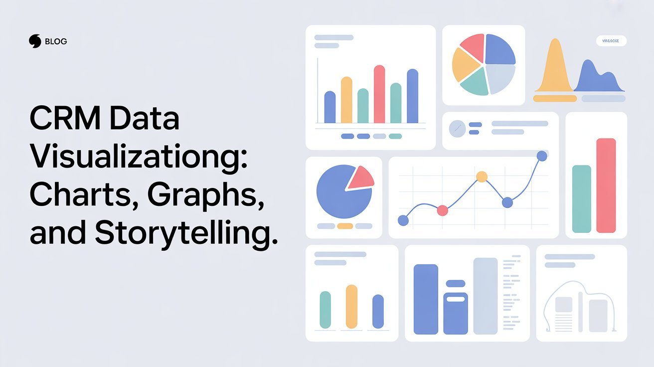


CRM data visualization transforms complex information into clear insights using charts, graphs, and storytelling. These visual tools enhance accessibility, making it easier for you to identify trends, patterns, and correlations. They boost engagement and drive data-driven strategies, helping teams make faster decisions. By using the right visualization tools, you can refine marketing campaigns and align your efforts towards common goals. Explore how effective data storytelling can further elevate your decision-making process.
Table of Contents
Key Takeaways
- CRM data visualization transforms complex data into clear charts and graphs, enhancing comprehension and engagement for better decision-making.
- Effective storytelling in data visualization focuses on clarity, guiding the audience through key insights with relatable examples.
- Using various chart types allows for effective comparison of datasets, helping identify trends and customer behavior over time.
- Tools like Tableau and Power BI facilitate interactive visualizations, making it easier to analyze and present CRM data.
- Engaging visuals foster collaborative discussions, driving alignment on strategies and improving overall campaign effectiveness.
The Significance of CRM Data Visualization
CRM data visualization plays an essential role in transforming raw data into actionable insights. By utilizing effective visualizations, you enhance data accessibility, making it easier to grasp complex information quickly.
When you present data visually, you engage your audience and improve their visual comprehension, allowing them to identify trends and patterns that might go unnoticed in traditional reports. This clarity empowers you to make informed decisions faster.
Instead of sifting through spreadsheets, you can interpret insights at a glance, which streamlines your workflow. Ultimately, effective CRM data visualization not only enhances your understanding but also elevates your team’s ability to act on data-driven strategies, fostering a more agile and responsive organization. Additionally, it is crucial to consider user empowerment when developing visualizations, as it enhances workflow efficiency and supports informed decision-making.
Key Benefits of Using Charts and Graphs
When it comes to presenting CRM data, charts and graphs are powerful tools that can greatly enhance your analysis. They offer clear, visual representations of complex information, making it easier for you to identify trends and patterns. Different chart types—like bar charts, line graphs, and pie charts—help you convey various aspects of your data effectively. Additionally, graph comparisons allow you to juxtapose multiple datasets, facilitating insightful discussions and decisions. Furthermore, the use of project management tools can streamline workflow processes and improve data visualization.
Here’s a quick reference table to illustrate:
| Chart Type | Use Case | Benefit |
|---|---|---|
| Bar Chart | Comparing categories | Easy comparison of values |
| Line Graph | Showing trends over time | Visualizes changes clearly |
| Pie Chart | Representing parts of a whole | Quick visual proportions |
Utilizing these tools can transform your CRM data analysis.
Essential Tools for CRM Data Visualization
Several essential tools can elevate your CRM data visualization efforts and streamline your analysis.
First, consider using data dashboards, which offer a centralized view of key metrics. These dashboards help you track performance in real-time, making data interpretation quicker and more efficient.
Next, invest in visualization software that allows you to create interactive charts and graphs, turning complex data into easily digestible visuals. Tools like Tableau and Power BI are popular options that provide robust features for customization and sharing.
Don’t forget collaboration tools that enable your team to work together on visualizations, fostering better insights. Additionally, utilizing search functionality can help you quickly find relevant information to enhance your data storytelling.
Best Practices for Effective Data Storytelling
To effectively convey your data’s story, focus on clarity and engagement. Use storytelling techniques that resonate with your audience, transforming raw numbers into compelling data narratives.
Start by identifying your main message; this will guide your visuals and guarantee they support your story. Use simple charts and graphs to highlight key points, avoiding clutter that can confuse viewers.
Incorporate relatable examples or anecdotes that connect your data to real-life scenarios, making it more impactful. Keep your visuals consistent in style and color to maintain a cohesive narrative flow.
Finally, invite feedback to refine your approach, assuring your storytelling resonates and engages your audience effectively. Remember, the goal is to make your data both understandable and memorable. Additionally, consider utilizing analytics solutions to enhance your decision-making process when crafting your data narratives.
Identifying Trends Through Visual Analytics
Identifying trends through visual analytics can greatly enhance your decision-making process. By leveraging visual patterns in your data, you can easily spot trends that might otherwise go unnoticed.
Here are some key benefits of trend identification through visual analytics:
- Quick Insights: Visuals allow you to grasp complex data at a glance.
- Enhanced Comparisons: You can compare multiple datasets visually, making it easier to identify correlations.
- User Engagement: Engaging visuals can capture attention and prompt discussions around trends.
- Informed Strategies: Understanding trends helps you develop data-driven strategies for growth.
Utilizing visual analytics effectively can transform your approach, enabling you to make informed decisions that drive success in your CRM efforts. Additionally, employing analytics solutions can further enhance your ability to interpret data trends comprehensively.
Enhancing Customer Engagement With Visual Data
While traditional methods of customer engagement often rely on text-heavy communications, incorporating visual data can greatly elevate the way you connect with your audience.
By utilizing charts and graphs, you can transform complex customer insights into easily digestible visuals. This not only grabs attention but also enhances visual engagement, making your message more memorable.
When you present data visually, you help customers quickly grasp key trends and information, leading to informed decisions. Additionally, engaging visuals can spark conversations and foster a deeper connection with your brand.
Embrace the power of visual data to create a compelling narrative that resonates with your customers, encouraging them to interact more and ultimately driving loyalty.
Case Studies: Successful CRM Data Visualization Implementations
In this section, you’ll explore real-world examples that highlight how companies have effectively visualized their CRM data.
From tracking sales performance metrics to enhancing team collaboration tools, these case studies showcase practical applications that you can learn from.
You’ll also see how targeted marketing campaigns benefit from clear data visualization.
Visualizing Sales Performance Metrics
Effective sales performance metrics can drive business growth, especially when visualized through a robust CRM system.
By leveraging a performance dashboard, you can gain insights into your sales funnel and enhance your decision-making processes. Here are some key metrics to visualize:
- Conversion Rates: Track the percentage of leads that turn into customers.
- Sales Cycle Length: Measure the time it takes to close a deal.
- Revenue Trends: Analyze sales growth over specific periods.
- Lead Sources: Identify which channels generate the most profitable leads.
Implementing these visualizations can help you pinpoint areas for improvement and foster a data-driven culture within your team, ensuring everyone is aligned with your sales objectives.
Enhancing Team Collaboration Tools
To boost team collaboration, integrating CRM data visualization tools can be a game-changer. You’ll find that visualizing data fosters better team dynamics, allowing everyone to grasp insights quickly.
For instance, a marketing team using collaborative platforms can share real-time dashboards that highlight key performance metrics. This transparency encourages open discussions and drives alignment on goals.
Case studies show that teams leveraging visual tools report improved engagement and faster decision-making. When team members can easily interpret data through charts and graphs, they’re more likely to contribute effectively.
In turn, this enhances overall productivity and morale. By embracing data visualization, you’ll empower your team to collaborate efficiently and make informed decisions together.
Targeting Marketing Campaign Effectiveness
When you leverage CRM data visualization, you can greatly enhance the effectiveness of your marketing campaigns. By utilizing clear visual data, you can refine your campaign segmentation strategies and measure performance effectively.
Here are some key benefits of CRM data visualization:
- Identify Target Audiences: Pinpoint the demographics that respond best to your campaigns.
- Analyze Trends: Spot patterns in customer behavior over time to adjust your strategies.
- Optimize Budgets: Allocate resources more effectively based on visualized performance metrics.
- Boost Engagement: Use visual insights to craft messages that resonate with your audience.
Frequently Asked Questions
How Do I Choose the Right Chart Type for My Data?
To choose the right chart type, assess your data type compatibility. Use chart selection strategies like identifying relationships or comparisons to guide your decision. Visual clarity and audience understanding should always remain your top priorities.
What Are Common Mistakes in CRM Data Visualization?
Data overload affects 70% of professionals, leading to confusion. To avoid mistakes in visualization, steer clear of excessive data, use coherent color choices, and focus on clarity. Simplifying your visuals enhances understanding and engagement considerably.
How Often Should I Update My Visualizations?
You should update your visualizations regularly, ideally monthly or quarterly, to maintain visualization relevance. Frequent updates keep your data fresh and guarantee you’re making decisions based on the most current information available.
Can I Use CRM Data Visualization for Forecasting?
Yes, you can use CRM data visualization for forecasting. By analyzing trends, you’ll improve forecasting accuracy, helping you make informed decisions and anticipate future demands based on historical patterns and insights from your data.
What Skills Are Needed for Effective Data Storytelling?
To tell a compelling data story, you’ll need strong analytical thinking and narrative techniques. Think of it like weaving a tapestry; each thread (data point) connects to create a bigger picture that resonates with your audience.
Conclusion
In the world of CRM data visualization, you’re not just crunching numbers; you’re crafting a story that resonates. Like a skilled artist with a blank canvas, you can turn raw data into compelling visuals that captivate your audience. Embrace the tools and practices that elevate your storytelling, and you’ll uncover insights that spark engagement and drive action. Remember, every chart and graph is a chapter in your narrative—make it one worth reading.


