
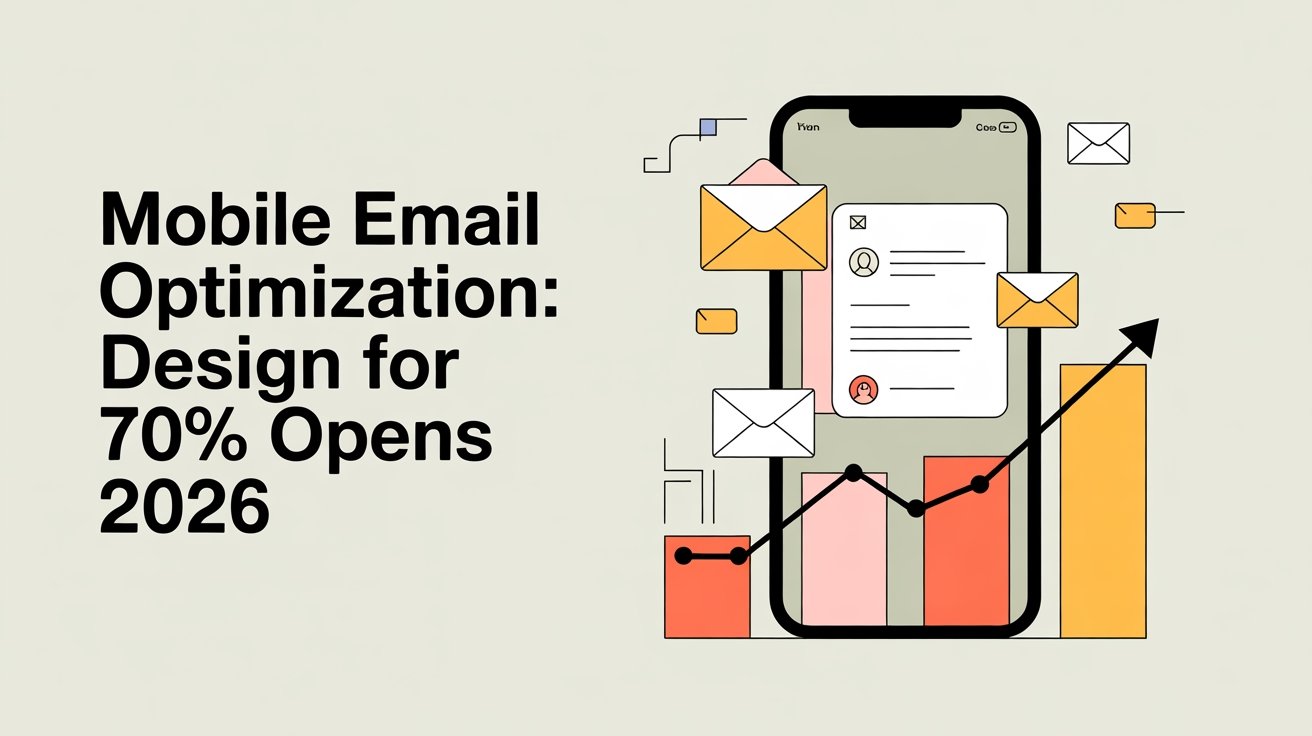


Mobile email optimization is essential, as over 50% of emails are opened on mobile devices, and this figure will likely reach 70% by 2026. To keep your audience engaged, use at least 14px font, guarantee touch targets are spacious, and maintain a simple, clean layout. Responsive templates enhance brand consistency and improve readability. Incorporating visuals and clear calls-to-action can guide responses effectively. Stay tuned to discover more strategies for maximizing your mobile email success.
Table of Contents
Key Takeaways
- Optimize email designs for mobile devices to accommodate the projected 70% of opens by 2026, ensuring high engagement rates.
- Utilize responsive email templates that adapt to various screen sizes, enhancing readability and user experience across devices.
- Prioritize content hierarchy with impactful headlines, concise text, and clear calls-to-action to guide user interactions on mobile screens.
- Incorporate visuals and adequate white space to improve content digestibility and maintain reader interest without overwhelming them.
- Conduct A/B testing on subject lines and layouts, analyze performance metrics, and gather user feedback to continuously refine email strategies.
Understanding Mobile Email Statistics
How often do you check your email on your phone? With mobile usage skyrocketing, it’s essential to understand your email habits.
Recent statistics show that over 50% of all email opens occur on mobile devices. This trend isn’t slowing down; by 2026, it’s expected to reach 70%.
You might find yourself reading emails during your commute or while waiting in line, which highlights the importance of optimizing your content for mobile.
If your emails aren’t easy to read or interact with on a small screen, you risk losing engagement.
By focusing on mobile-friendly practices, you can capture attention and drive action, ensuring your message doesn’t get lost in the clutter of a crowded inbox.
Optimizing for mobile is crucial for user experience disruption in today’s fast-paced digital environment—make sure your emails stand out!
Optimize for success!
Key Elements of Mobile-Friendly Design
Creating mobile-friendly emails hinges on several key design elements that enhance user experience.
First, use appropriate font sizes; aim for at least 14px for body text to guarantee readability on smaller screens.
Second, consider touch targets. Links and buttons should be large enough—ideally at least 44px by 44px—to make tapping easy for users. Avoid placing clickable elements too close together to prevent accidental clicks.
Furthermore, keep your layout simple and visually appealing, prioritizing essential information. Use white space strategically to make content digestible.
Finally, test your emails on various devices to confirm they look great everywhere. Additionally, ensure you provide user-friendly experiences that guide users toward alternative actions if they encounter any issues.
The Importance of Responsive Email Templates
Responsive email templates are essential for creating an enhanced user experience, ensuring your messages look great on any device.
When your emails are visually appealing and easy to read, you’re likely to see increased open rates.
Plus, using consistent branding across devices helps reinforce your identity with every interaction. Additionally, evaluations aim to empower users in decision-making, which can lead to improved engagement with your email campaigns.
Enhanced User Experience
When you prioritize an enhanced user experience in your email marketing, responsive email templates become essential. These templates adapt seamlessly to various devices, ensuring your content looks great no matter where it’s viewed.
By focusing on a clean user interface, you make it easier for your audience to navigate and engage with your emails. Incorporating user feedback is vital; it helps you understand what your subscribers appreciate and need from your designs.
When users find your emails visually appealing and easy to read, they’re more likely to interact with your content. Investing in responsive templates not only improves the overall experience but also fosters a stronger connection with your audience, ultimately leading to better engagement in your campaigns.
Increased Open Rates
A significant number of email recipients are likely to open messages that display well on their devices, making responsive email templates essential for boosting open rates.
When you implement effective open rate strategies, you enhance mobile engagement and drive better results.
Here are three key benefits of using responsive email templates:
- Improved Readability: Text and images adjust seamlessly, ensuring your message is easy to read on any screen size.
- Increased Click-Through Rates: Engaging layouts encourage recipients to take action, leading to higher interaction levels.
- Better User Experience: A well-designed email fosters positive feelings, making recipients more likely to open future messages.
Consistent Branding Across Devices
Consistent branding across devices is essential for maintaining your brand’s identity and ensuring that recipients recognize your emails instantly.
When you prioritize brand consistency, you create a seamless experience for your audience, no matter what device they’re using. Responsive email templates help achieve cross-device alignment, allowing your emails to display beautifully on smartphones, tablets, and desktops alike.
This uniformity not only reinforces your brand but also enhances user experience, leading to higher engagement rates. Remember, when your emails look professional and cohesive, recipients are more likely to trust your brand and take action.
Invest in responsive designs that adapt to various screen sizes, ensuring your messages resonate effectively across all platforms. Stay memorable and impactful with every email you send!
Crafting Compelling Subject Lines for Mobile
When it comes to mobile emails, your subject lines can make or break your message.
Keep them short and punchy, using actionable language that grabs attention.
Don’t forget to personalize your approach, as it’s the key to connecting with your audience. Additionally, optimizing for user experience can significantly enhance your email engagement rates.
Keep It Short
Crafting compelling subject lines for mobile devices is essential, as users often skim their inboxes quickly.
To capture attention amidst mobile trends and changing user behavior, keep your subject lines short and impactful. Here are some tips to help you:
- Limit character count: Aim for 30-40 characters to guarantee visibility on small screens.
- Use clear language: Avoid jargon; make your message easily understandable.
- Highlight value: Convey the benefits or urgency right away to entice opens.
Use Actionable Language
Grab your audience’s attention by using actionable language in your subject lines. Your goal is to align with mobile user behavior, encouraging immediate engagement. Crafting compelling subject lines with actionable insights can boost open rates considerably.
Here’s a simple table to guide you:
| Actionable Language | Example Subject Lines | Expected Outcome |
|---|---|---|
| Create urgency | “Grab Your Deal Before It’s Gone!” | Increased urgency |
| Encourage action | “Join the Webinar Now!” | Higher participation |
| Offer value | “Unlock Your Free Guide Today!” | Enhanced perceived value |
Using these strategies in your email subject lines will help you connect better with your audience and drive action.
Personalization Matters Most
Personalization is key to creating compelling subject lines that resonate with mobile users. When you craft subject lines that reflect personalized content, you’re more likely to grab attention and drive opens.
Consider these strategies:
- Use dynamic segmentation to tailor messages based on user behavior and preferences.
- Incorporate the recipient’s name or location for a personal touch.
- Highlight relevant offers or topics that align with their interests.
Optimizing Content for Quick Engagement
As mobile users often skim through their emails quickly, optimizing your content for immediate engagement is crucial.
Start by establishing a clear content hierarchy; place your most critical information at the top. Use concise, impactful headlines that grab attention instantly. Break up text with bullet points or short paragraphs to enhance readability.
Visual balance plays a key role in keeping your audience engaged. Incorporate eye-catching images or graphics that complement your message without overwhelming the text.
Verify there’s enough white space to avoid clutter, guiding the reader’s eye seamlessly through your email. By prioritizing clarity and visual appeal, you can markedly boost engagement and encourage users to take action without delay. Additionally, utilizing automation tools can help streamline your email design process for better efficiency.
Testing and Analyzing Mobile Email Performance
While optimizing your mobile email content is essential, testing and analyzing its performance is equally important to guarantee you’re meeting your audience’s needs.
To effectively assess how your emails are doing, consider these strategies:
- A/B testing: Experiment with different subject lines, layouts, or calls to action to see what resonates best.
- Performance metrics: Track open rates, click-through rates, and conversion rates to gauge success.
- User feedback: Collect insights from your audience to identify areas for improvement.
In addition to these strategies, it’s crucial to address broken links that may affect user experience.
Frequently Asked Questions
What Are the Most Common Mobile Email Clients Used Today?
Today, you’ll find Gmail dominating mobile email clients, thanks to its user-friendly interface and features. Outlook’s also popular, especially among business users, providing robust tools for managing emails efficiently on mobile devices.
How Does Email Accessibility Impact Mobile Email Optimization?
Email accessibility boosts mobile email optimization considerably; studies show 80% of users prefer readable content. By incorporating inclusive design principles, you enhance email readability, ensuring everyone can engage with your messages effectively and enjoyably.
What Are the Best Practices for Mobile Email CTA Placement?
For ideal mobile email CTA placement, guarantee your buttons have high visibility and are finger-friendly. Position them at the top and bottom of your email, making it easy for users to engage without frustration.
How Can I Ensure My Emails Load Quickly on Mobile Devices?
To guarantee your emails load quickly on mobile, optimize images and use responsive design. Did you know 53% of mobile users abandon sites that take over three seconds to load? Speed matters for engagement!
What Legal Considerations Should I Be Aware of for Mobile Emails?
You should guarantee you obtain email consent from recipients and comply with privacy regulations, like GDPR or CAN-SPAM. This protects their data and avoids legal issues, so your mobile emails remain effective and trustworthy.
Conclusion
As you navigate the ever-evolving landscape of mobile email, remember that each message you craft is like a window into your brand’s soul. By embracing responsive design and compelling content, you’re not just sending emails; you’re building connections that resonate. Testing and analyzing your efforts is like tending a garden—cultivating growth and engagement. So, as you optimize for those 70% opens in 2026, let each email bloom into opportunities that captivate and inspire your audience.


")