
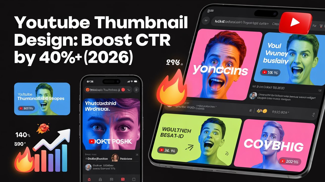


To boost your YouTube CTR by 40% or more in 2026, focus on designing compelling thumbnails. Start with eye-catching visuals and bold colors, embracing color psychology to create emotional connections. Use clear, readable typography and expressive imagery to draw viewers in. Don’t forget mobile optimization, as most users watch on smaller screens. By mastering these elements and staying on top of emerging trends, you can greatly enhance your video’s appeal and effectiveness. There’s much more to explore!
Table of Contents
Key Takeaways
- Utilize eye-catching visuals and bold graphics to immediately attract viewer attention and enhance click-through rates.
- Implement high contrast colors to create visual hierarchy and ensure that text and images stand out effectively.
- Incorporate expressive faces in thumbnails to evoke emotions and increase viewer engagement.
- Conduct A/B testing to analyze thumbnail performance and make data-driven adjustments for optimal CTR.
- Embrace minimalist aesthetics and interactive elements in designs to enhance clarity and viewer interaction in 2026.
Understanding the Importance of Thumbnails
When you consider the vast amount of content on YouTube, it’s clear that a compelling thumbnail is essential for grabbing viewers’ attention.
The thumbnail significance lies in its ability to create an instant connection with potential viewers. It serves as the first impression, often determining whether someone clicks on your video or scrolls past it.
Understanding viewer psychology is fundamental here; people are naturally drawn to visuals that evoke curiosity or emotion. A well-designed thumbnail can spark interest and set the tone for what’s to come, enticing viewers to engage with your content. In fact, search functionality can significantly enhance user navigation experience, making it easier for viewers to find engaging videos.
Key Elements of Effective Thumbnail Design
To create an effective thumbnail, you need to contemplate several key elements that can greatly impact viewer engagement.
Start with eye-catching visuals—bold images or graphics that represent your video content. Incorporate readable text; use large, clear fonts that convey your message quickly.
Contrast is essential; make sure your elements stand out against the background. Also, consider using faces; thumbnails with expressive faces tend to attract more clicks.
Finally, simplicity is important; avoid clutter for a clean, focused look. By applying these thumbnail design basics, you can enhance your video’s appeal.
Additionally, ensuring your thumbnails are optimized for clear navigation can lead to improved user experience and engagement. Check out effective thumbnail examples to inspire your creativity and see how these elements come together for maximum impact.
Color Psychology in Thumbnails
Color plays an essential role in shaping viewer perceptions and emotions, making it a powerful tool in thumbnail design. Understanding color associations can enhance your thumbnails’ emotional impact and brand alignment.
Here are three ways to evoke emotion through color:
- Warm Colors: Reds and oranges create excitement and urgency, driving viewers to click.
- Cool Colors: Blues and greens evoke calmness and trust, appealing to a more reflective audience.
- Contrast Effects: High contrast color combinations can grab attention and highlight key elements.
Cultural influences also affect how people perceive colors, so consider your target audience. Additionally, leveraging data-driven decision-making can further refine your thumbnail strategies for better engagement.
Typography Choices That Capture Attention
When it comes to your YouTube thumbnails, the right typography can make all the difference.
You’ll want to choose font styles that reflect your content while ensuring size and readability draw viewers in.
Don’t forget to play with color contrast to make those words pop and grab attention instantly. Additionally, utilizing effective software solutions can greatly enhance your design process and improve overall thumbnail appeal.
Font Styles Matter Most
Choosing the right font style can make or break your YouTube thumbnail. It’s vital to focus on how your typography reflects your brand identity.
Here are three important aspects to take into account:
- Font Pairing: Choose complementary fonts that enhance readability and create an appealing visual hierarchy.
- Emotional Impact: Select styles that evoke the right feelings. A bold font can convey excitement, while a script can suggest elegance.
- Style Consistency: Confirm your font choices align with your overall branding to maintain a cohesive look.
When you nail these elements, your thumbnails not only grab attention but also communicate your message effectively.
This boosts your viewers’ emotional connection and increases your click-through rates.
Size and Readability Factors
While selecting the perfect fonts is essential, size and readability play a significant role in capturing your audience’s attention. When designing your YouTube thumbnail, consider the dimensions and how they affect readability factors. A well-chosen font size guarantees your message is clear, even on smaller screens.
Here’s a quick reference table for ideal text sizes based on thumbnail dimensions:
| Thumbnail Size | Font Size (Headlines) | Font Size (Subtext) |
|---|---|---|
| 1280 x 720 | 60-70pt | 30-40pt |
| 640 x 360 | 30-40pt | 15-20pt |
| 480 x 270 | 24-30pt | 10-15pt |
| 2560 x 1440 | 80-90pt | 40-50pt |
| 1920 x 1080 | 70-80pt | 35-45pt |
Choose wisely to enhance your CTR!
Color Contrast Techniques
To grab your audience’s attention, effective color contrast in typography is essential, as it helps your text stand out against the background.
Using the right color pairing and ensuring good contrast ratios can greatly boost your thumbnail’s impact. Here are three techniques to evaluate:
- Light vs. Dark: Use light text on a dark background or vice versa to create immediate visibility.
- Complementary Colors: Pair colors from opposite ends of the color wheel for striking contrast that grabs attention.
- Bold Fonts: Combine bold typography with high-contrast colors to enhance readability and emotional engagement.
The Role of Imagery and Visuals
Imagery and visuals play an essential role in capturing viewers’ attention on YouTube, as they can make or break a video’s success. Effective visual storytelling can convey your message quickly and powerfully, drawing in your audience.
When you use compelling images, you create an emotional impact that resonates with viewers, encouraging them to click on your video. Think about how your visuals can evoke feelings or tell a story that aligns with your content.
Use high-quality images, bold colors, and relatable expressions to enhance your thumbnails. Remember, you want to stimulate curiosity and interest through visuals alone. Additionally, implementing search functionality can help viewers find content that resonates with their interests, further boosting engagement.
Trends in Thumbnail Layout for 2026
As you look ahead to 2026, you’ll notice bold typography choices becoming a staple in thumbnail design. Minimalist aesthetics will also take center stage, allowing visuals to shine without clutter. Plus, eye-catching color palettes will grab viewers’ attention and set your videos apart from the rest. Additionally, incorporating sustainable design elements can enhance viewer engagement while minimizing your ecological footprint.
Bold Typography Choices
Bold typography is set to dominate YouTube thumbnails in 2026, grabbing attention and conveying messages with clarity.
Using bold fonts and playful typography, you can create dynamic layouts that stand out. Here are three impactful styles to contemplate:
- Contrasting Weights: Mix thick and thin fonts to create visual interest.
- Unique Styles: Incorporate vintage fonts for a nostalgic touch or modern trends for a fresh look.
- Emotional Appeal: Use impactful phrases that resonate with viewers, sparking curiosity and connection.
Minimalist Design Aesthetics
While many creators are drawn to vibrant colors and complex designs, minimalist aesthetics are making a strong comeback in YouTube thumbnail layouts for 2026. This trend emphasizes clean lines and clarity, allowing your content to stand out without visual clutter.
By utilizing minimalist color schemes, you can create a strong visual impact that resonates with viewers. Think soft pastels or monochromatic palettes that draw attention to your key message.
Incorporating simple graphic elements, like basic shapes or icons, can enhance your thumbnails without overwhelming them. This approach not only boosts engagement but also guarantees your branding remains consistent and recognizable.
Embrace minimalism, and you’ll likely see a significant increase in click-through rates.
Eye-Catching Color Palettes
Minimalist designs have their charm, but vibrant, eye-catching color palettes are set to dominate YouTube thumbnails in 2026.
These stunning visuals not only grab attention but also evoke emotional responses and enhance brand alignment.
Here are three key elements to contemplate:
- Contrasting Hues: Use vibrant combinations to create a visual hierarchy that directs viewers’ eyes.
- Seasonal Palettes: Incorporate colors that reflect current trends and cultural influences, making your thumbnails timely and relevant.
- Color Symbolism: Leverage color meanings to set the mood and resonate with your audience.
Incorporating Branding Into Thumbnails
Incorporating branding into your YouTube thumbnails is essential for creating a cohesive visual identity that resonates with your audience.
Start by ensuring branding consistency through color harmony and logo placement. This helps reinforce audience recognition and makes your content instantly identifiable.
Use your logo strategically; it should enhance your design alignment without overwhelming the thumbnail. Consider how your visuals convey brand storytelling, evoking an emotional appeal that draws viewers in.
By maintaining a consistent aesthetic, you not only strengthen your brand but also foster trust among your audience.
A/B Testing Your Thumbnails for Optimal Performance
A/B testing your thumbnails is essential for figuring out what grabs your audience’s attention.
By analyzing performance metrics, you can see which designs resonate best with viewers.
Experimenting with different variations helps you fine-tune your approach for ideal results.
Importance of A/B Testing
When you want to maximize your video’s reach and engagement, A/B testing your thumbnails becomes essential. By employing effective A/B testing strategies, you can refine your designs and cater to your audience preferences.
Here’s why it matters:
- Informed Choices: Using testing tools allows you to make data-driven decisions, ensuring your thumbnails resonate with viewers.
- Continuous Improvement: Regular performance analysis leads to better design iterations, enhancing your thumbnails over time.
- Engagement Boost: Testing frequency and optimization cycles help you discover which thumbnail variations yield the highest engagement metrics.
Analyzing Performance Metrics
Once you’ve implemented A/B testing for your thumbnails, the next step is analyzing the performance metrics to understand what works best. This performance analysis is essential for improving your click-through rate (CTR). Focus on metric tracking to compare the results of your tested thumbnails.
Here’s a simple table to help you visualize the metrics:
| Thumbnail Version | CTR (%) | Engagement Rate (%) |
|---|---|---|
| Version A | 5.2 | 30 |
| Version B | 7.3 | 45 |
| Version C | 6.1 | 35 |
| Version D | 8.0 | 50 |
Implementing Design Variations
To maximize your thumbnail’s impact, experimenting with design variations is essential. A/B testing helps you understand what resonates with your audience.
Here’s how you can assess your design iterations effectively:
- Color Choices: Bright, contrasting colors can evoke excitement and urgency.
- Text Placement: Experiment with different text placements to see what grabs attention.
- Image Focus: A clear focal image can create a stronger emotional connection.
Analyzing Competitor Thumbnails
Analyzing competitor thumbnails can provide valuable insights into what captures viewers’ attention and drives engagement. Start by conducting a thorough competitor analysis; identify channels similar to yours and examine their most successful videos.
Look for common design elements, color schemes, and text styles that stand out. Notice how they use images and expressions to evoke emotions.
Next, focus on thumbnail optimization by considering what works for your niche. Are bold colors more effective, or do minimalist designs resonate better?
Take notes on the strategies your competitors employ, then adapt those ideas to enhance your own thumbnails. By understanding what attracts viewers, you can create compelling thumbnails that increase your click-through rate and elevate your content’s performance.
Tools and Software for Creating Thumbnails
While choosing the right tools and software can greatly influence your thumbnail design, it’s essential to find options that suit your skills and needs.
Here are three top choices to keep in mind:
- Canva: This user-friendly platform offers a variety of templates and features perfect for beginners and pros alike.
- Adobe Spark: With its powerful online editing tools, you can create stunning thumbnails that capture attention and drive clicks.
- Snappa: This thumbnail design software simplifies the process, allowing you to customize designs quickly and effectively.
Utilizing these tools can elevate your thumbnails, helping you create eye-catching visuals that boost your CTR.
Mobile Optimization: Designing for Smaller Screens
As more viewers access YouTube on their mobile devices, ensuring your thumbnails are optimized for smaller screens becomes essential.
Mobile viewing presents unique challenges, like limited screen dimensions and design constraints. You’ll need to make layout adjustments that enhance user experience while addressing visibility challenges.
Keep your graphics bold and easy to read; scaling graphics effectively can help maintain clarity. Consider how touch interactions affect engagement—thumbnails should entice viewers to tap without overwhelming them.
Use high-contrast colors and large text to improve visibility, ensuring your message stands out even on a tiny screen.
Case Studies: Successful Thumbnails in Action
Successful thumbnails can greatly impact your video’s performance, and examining real-world examples helps illustrate what works.
Here are three thumbnail success stories showcasing effective strategies:
- Bold Colors & Text: A travel vlogger used vibrant colors and large, clear text to stand out in feeds, boosting their CTR by 50%.
- Emotional Faces: A beauty channel featured close-ups of excited faces, which created an emotional connection, leading to a 45% increase in clicks.
- Curiosity Elements: A cooking channel included a mysterious dish in the background, enticing viewers to learn more, resulting in a 60% rise in engagement.
Future Trends in YouTube Thumbnail Design
With the rapid evolution of digital media, YouTube thumbnail design is set to undergo significant changes in the coming years.
You’ll see AI generated thumbnails becoming mainstream, allowing for tailored visuals that resonate with viewers. As user engagement trends shift, incorporating visual storytelling techniques will be essential for capturing attention.
Expect interactive elements integration to rise, making thumbnails more engaging. Future design software will streamline this process, enhancing your creative options.
Augmented reality thumbnails could also emerge, offering immersive previews. Emotion driven designs will play a key role, appealing directly to viewers’ feelings.
Finally, predictive analytics usage will guide your designs, ensuring they align with audience preferences and maximize click-through rates.
Embrace these trends to elevate your content’s visibility!
Frequently Asked Questions
How Do Thumbnails Impact Youtube’s Algorithm?
Thumbnails considerably impact YouTube’s algorithm by driving thumbnail engagement. When viewers click more on eye-catching thumbnails, the algorithm favors your content, boosting visibility and increasing your chances of reaching a larger audience.
What Are Common Mistakes to Avoid in Thumbnail Design?
Avoid using clashing thumbnail colors that scream chaos instead of clarity. Make certain your text readability shines like a beacon, drawing viewers in. Don’t let poor design choices drown your message in a sea of confusion.
Can I Use Copyrighted Images in Thumbnails?
You can’t use copyrighted images in thumbnails without permission, unless it falls under fair use guidelines. Always check copyright guidelines to avoid potential legal issues and guarantee your content remains compliant and safe for viewers.
How Often Should I Update My Thumbnails?
You should refresh your thumbnails regularly—ideally every few months. Consider seasonal updates to keep them relevant. Imagine viewers being drawn in by fresh visuals; it could dramatically boost your engagement and click-through rates.
What Dimensions Should My Thumbnails Be for Best Results?
Your thumbnails should be 1280 x 720 pixels for ideal resolution, ensuring a 16:9 aspect ratio. This thumbnail size enhances visibility across devices, helping you attract more viewers and boost your channel’s engagement.
Conclusion
In the world of YouTube, your thumbnail is like a storefront window—if it doesn’t catch the eye, potential viewers will simply walk by. By applying the principles we’ve discussed, you can boost your click-through rates by over 40%. Think of it as dressing your video for success; a well-crafted thumbnail can turn casual browsers into enthusiastic viewers. So, embrace creativity and keep experimenting—your next viral hit could be just a thumbnail away!


