
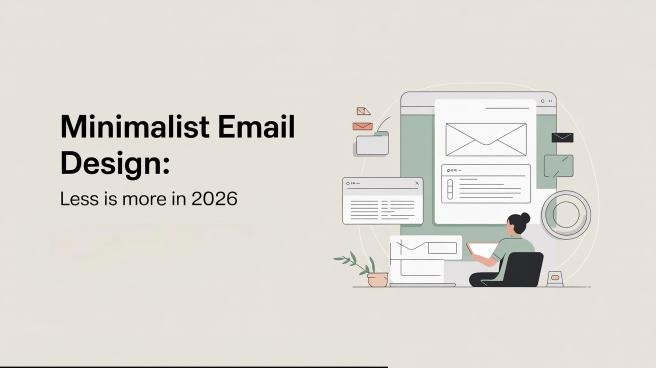


In 2026, minimalist email design focuses on stripping away clutter to let your message shine. You’ll want to embrace simplicity, using clear fonts, limited colors, and ample white space for maximum impact. A clean layout enhances readability and engagement, making it easier for recipients to act. Personalization and strong calls-to-action will further boost your effectiveness. By mastering these principles, you can elevate your email campaigns and connect with your audience more powerfully—discover more tips and strategies ahead.
Table of Contents
Key Takeaways
- Embrace simplicity in email design to enhance message clarity and eliminate distractions for better user experience in 2026.
- Utilize ample white space to improve readability and foster engagement through an inviting and organized layout.
- Choose classic and legible typography while limiting color palettes to create a cohesive and visually appealing design.
- Personalize subject lines and CTAs to increase open rates and drive engagement effectively with targeted messaging.
- Monitor performance metrics to refine strategies and adapt to future trends like augmented reality and eco-friendly practices.
The Essence of Minimalism in Email Design
The beauty of minimalism in email design lies in its simplicity and clarity.
Embracing a Zen Influence, you can create an environment where your message shines through without distractions.
A Simplicity Mindset encourages you to strip away unnecessary elements, focusing instead on the essentials.
Think about how each component—text, images, and colors—serves a purpose.
You want your audience to engage with your content, not get lost in a cluttered layout.
By prioritizing whitespace and clean lines, you invite readers to absorb your message effortlessly.
Minimalist design isn’t just about looking good; it’s about enhancing the user experience.
When you adopt this approach, you foster a calm, inviting atmosphere that resonates with your audience and makes your emails more effective.
Key Principles of Minimalist Email Design
Embracing minimalism in email design means adhering to specific principles that enhance clarity and engagement.
First, establish hierarchy levels to guide your readers through the content. Use larger fonts for headings and smaller fonts for body text, ensuring that important information stands out.
Next, implement contrast techniques to create visual interest. This can be achieved by combining light and dark colors or varying font weights. Limit your color palette to two or three complementary shades to maintain simplicity.
Additionally, use ample white space to avoid clutter and help your content breathe.
Finally, focus on concise messaging; every word should serve a purpose.
Benefits of a Minimalist Approach
When you adopt a minimalist approach in your email design, you enhance readability and keep your audience focused on the key message.
This simplicity also leads to faster load times, making it easier for recipients to engage with your content.
Plus, a streamlined user experience means your emails are more likely to achieve their intended goals.
Enhanced Readability and Focus
How can a minimalist email design enhance your reading experience? By stripping away distractions, it allows you to focus on the essential content.
With clean layouts and straightforward text, you can improve your reading habits.
You’ll find it easier to digest information when it’s presented clearly and concisely.
Minimalist design encourages the use of focus techniques, like prioritizing key messages and using ample white space.
This layout helps your eyes move smoothly across the screen, reducing cognitive overload.
You’ll spend less time searching for important points and more time engaging with the material.
Ultimately, a minimalist approach transforms your email interactions into streamlined experiences, boosting comprehension and retention.
Embrace simplicity for a more effective reading journey.
Faster Load Times
Minimalist email design not only enhances readability but also greatly improves load times. By stripping away unnecessary elements, you reduce the amount of data your emails need to load. This simple approach can lead to faster delivery and better engagement.
| Benefit | Description | Impact on Load Time |
| DNS Optimization | Streamlines domain resolution | Reduces latency |
| Server Upgrades | Enhances processing speed | Improves delivery time |
| Fewer Images | Less data to download | Quickens load speed |
| Simplified Code | Minimizes file size | Speeds up loading |
| Direct Content | Optimizes user experience | Eliminates delays |
Simplified User Experience
Clarity is key in communication, especially in email design.
A minimalist approach simplifies your user experience, making it easier for recipients to engage with your content.
By focusing on essential elements, you can create emails that are both visually appealing and functional.
Here are some benefits of this design philosophy:
- Quick comprehension: Users grasp your message without distractions.
- Enhanced accessibility: Simplified apps and intuitive websites cater to diverse audiences.
- Increased engagement: Clear calls-to-action encourage instant responses.
- Better mobile optimization: Minimal designs adapt seamlessly to various devices.
Designing for Clarity: The Importance of White Space
White space acts as the silent partner in effective email design, guiding your reader’s eye and enhancing comprehension. By utilizing whitespace psychology, you create an inviting atmosphere that allows your message to breathe. Space innovation isn’t just about aesthetics; it’s about ensuring clarity and focus on your key points.
| Element | Purpose | Benefit |
| Headings | Organize content | Easy navigation |
| Paragraphs | Separate ideas | Improved readability |
| Margins | Frame the content | Enhanced focus |
When you embrace white space in your designs, you not only improve visual appeal but also foster engagement. Remember, less truly is more when clarity is your goal.
Typography: Choosing the Right Fonts
Effective communication in email design doesn’t stop at white space; the choice of typography plays a pivotal role in how your message is received.
Selecting the right fonts can enhance readability and engagement.
Here are some tips to keep in mind:
- Stick to the classics: Use serif and sans-serif fonts for a timeless look.
- Explore Experimental Typefaces: Don’t shy away from unique fonts that reflect your brand personality.
- Embrace simplicity: Avoid overly decorative fonts that can distract from your message.
- Consider Ancient Scripts: They can add cultural depth, but make sure they’re legible.
Color Palette: The Power of Simplicity
A well-chosen color palette can greatly impact your email’s effectiveness. By opting for simplicity, you allow your message to shine.
Consider using Eco Palettes, which feature earthy tones and promote sustainability.
These colors not only evoke a sense of calm but also resonate with environmentally conscious readers.
On the other hand, Vintage Schemes can add a nostalgic touch, utilizing muted hues and classic combinations that foster warmth and familiarity.
By limiting your color choices to two or three shades, you create a cohesive look that’s easy on the eyes.
Remember, less is more; a simple palette enhances readability and keeps your audience focused on your content.
Embrace the power of simplicity, and watch your emails transform.
Imagery: When Less Is More
How can you make a strong impact with your email imagery while keeping it simple?
Focus on quality over quantity.
By using fewer images, you can highlight the ones that truly resonate with your message.
Pay attention to photo composition and image framing; they can enhance your narrative without overwhelming the viewer.
- Choose a single, striking image that aligns with your content.
- Use negative space effectively to draw attention to key elements.
- Make sure your visuals are high resolution for a professional look.
- Keep text overlays minimal to maintain clarity.
Crafting Compelling Subject Lines
Unlock the potential of your email campaigns by crafting compelling subject lines that grab attention and spark curiosity.
Start by using personalization strategies; addressing your recipients by name can greatly increase open rates.
Tailor your subject lines to reflect their interests or past interactions, making them feel special.
Next, don’t underestimate the power of A/B testing.
Experiment with different phrasing, emojis, and lengths to see what resonates most with your audience.
Analyze the results to refine your approach continuously.
Call-to-Action: Essential Elements of Minimalism
Crafting compelling subject lines sets the stage for your email, but a strong call-to-action (CTA) is what drives your audience to engage further.
To create an effective minimalist CTA, consider these essential elements:
- Clear Language: Use direct, concise wording to eliminate confusion.
- Visual Appeal: Design your CTA button to stand out, using contrasting colors.
- Urgency: Implement incentive strategies, like limited-time offers, to encourage immediate action.
- Relevance: Align the CTA with your audience’s needs and desires, tapping into CTA psychology.
Mobile Optimization: Keeping It Simple
In today’s mobile-centric world, ensuring your email design is optimized for smaller screens is essential.
You need to focus on screen adaptability to create an effective experience for your readers.
Aim for a clean layout that adjusts seamlessly across devices, allowing your content to shine without unnecessary distractions.
When it comes to touch navigation, make sure your buttons and links are large enough for easy tapping.
Avoid crowded designs—less truly is more.
Use ample white space to guide your audience through the email effortlessly.
Analyzing Performance: Metrics for Success
When you track the success of your minimalist email designs, focusing on key metrics is essential.
Open rates reveal how well your subject lines engage recipients, while click-through metrics show the effectiveness of your content.
Finally, conversion tracking gives you insights into how many of those clicks lead to desired actions, helping you refine your approach.
Open Rate Analysis
How can you truly gauge the effectiveness of your minimalist email design?
Analyzing open rates is essential for understanding your audience’s engagement.
You’ll want to implement effective timing strategies and segmentation techniques to enhance your results.
Focus on these key aspects:
- Audience Segmentation: Tailor your emails to specific demographics for better relevance.
- Timing Strategies: Experiment with sending times to find when your audience is most likely to open emails.
- Subject Line Testing: Use A/B testing to see which subject lines drive higher open rates.
- Continuous Monitoring: Regularly track and analyze open rates to adapt your approach as needed.
Click-Through Metrics
Open rates provide valuable insight into initial engagement, but to truly assess your minimalist email design’s effectiveness, click-through metrics are where the real action lies.
These metrics show how many recipients clicked on your email’s links, giving you a clear picture of content resonance.
For instance, if you’ve integrated video content, track how many viewers clicked to watch.
Additionally, consider the impact of mobile apps on your design. Users often engage with emails through their phones, so make sure your links are mobile-friendly.
Analyzing click-through rates helps you understand which elements captivate your audience and drive actions.
Conversion Tracking Insights
Tracking conversions is essential for understanding the true impact of your minimalist email design.
It helps you refine your approach and enhances funnel optimization.
By analyzing conversion rates, you can gather valuable behavioral insights that drive your strategy forward.
Here are some key metrics to monitor:
- Open Rate: Gauge initial interest in your email content.
- Click-to-Open Rate (CTOR): Assess engagement with your email’s call-to-action.
- Conversion Rate: Measure how many recipients take the desired action.
- Bounce Rate: Identify issues with email delivery and recipient engagement.
Future Trends in Minimalist Email Design
What might the future hold for minimalist email design?
As technology evolves, you’ll see augmented reality (AR) making its way into emails, allowing you to engage your audience in ways you never thought possible.
Imagine immersive experiences that enhance your message without cluttering the design.
Additionally, eco innovations will play a vital role in how you approach minimalist aesthetics.
You’ll prioritize sustainable practices, using energy-efficient coding and eco-friendly templates that reduce the carbon footprint of your campaigns.
As user preferences shift towards simplicity, expect clean layouts with bold typography and ample white space.
These trends will make your emails not only visually appealing but also environmentally conscious, aligning with both your brand values and your audience’s expectations.
Frequently Asked Questions
How Can I Transition From Complex to Minimalist Email Designs?
To shift to minimalist email designs, you’ll apply simplification strategies like reducing clutter and prioritizing essential content. Embrace aesthetic evolution by focusing on clean layouts, legible fonts, and consistent branding to enhance user experience.
What Tools Assist in Creating Minimalist Email Templates?
To create minimalist email templates, use tools like Mailchimp or Campaign Monitor for their user-friendly interfaces. Explore plugin integrations that simplify design choices and enhance functionality, ensuring your templates maintain clarity and effectiveness.
Are There Specific Industries That Benefit More From Minimalist Design?
Industries like banking interfaces and education platforms thrive with minimalist design. It simplifies complex information, making it easier for users to navigate. You’ll find clarity and engagement skyrocketing when you embrace this approach.
How Do I Measure Audience Response to Minimalist Email Campaigns?
You can measure audience response to minimalist email campaigns by analyzing response metrics like open rates and click-through rates. Additionally, track engagement data, such as time spent on the email and conversion rates, for deeper insights.
Can Minimalist Design Be Effective for Promotional Email Campaigns?
Absolutely, minimalist design can boost audience perception, with 70% of consumers preferring clean visuals. It strengthens brand identity, making your promotional emails memorable while enhancing engagement. Keep it simple, and watch your campaigns thrive!
Conclusion
In 2026, embracing minimalist email design isn’t just a trend; it’s a necessity. Picture a cluttered inbox filled with chaotic messages versus a clean, focused email that invites action. By stripping away the excess, you create clarity, guiding your audience effortlessly. Your typography speaks volumes while white space breathes life into each message. As you adopt this approach, you’ll not only enhance user experience but also boost engagement, proving that less truly is more in the world of email.


