


To optimize your email CTAs for conversions, focus on button design that grabs attention. Use bold colors that contrast with the background and experiment with sizes—large buttons often draw the most clicks. Craft your copy using action-oriented phrases like “Get Started Now!” to create urgency. Incorporate A/B testing to discover what resonates with your audience. Want to know more about making your CTA buttons irresistible? There’s plenty more to unpack!
Table of Contents
Key Takeaways
- Use bold, contrasting colors for CTA buttons to enhance visibility and draw attention, with red buttons achieving the highest click rates.
- Optimize button size; larger buttons are more eye-catching and can significantly improve engagement and click rates compared to smaller ones.
- Incorporate action-oriented and urgent language in your CTA copy to inspire immediate action and motivate users to click.
- Implement A/B testing to evaluate different button colors and sizes, helping to identify what resonates best with your audience.
- Position buttons strategically above the fold for easy visibility, ensuring they are designed for easy tapping on mobile devices.
Understanding the Importance of CTAs in Email Marketing
Call-to-actions (CTAs) are the heartbeat of email marketing, driving engagement and conversions.
They play an essential role in guiding your audience through the sales funnel, ensuring they don’t lose interest.
When you craft compelling CTAs, you boost audience retention, keeping your subscribers engaged and keen to explore more of what you offer.
CTAs aren’t just buttons; they’re strategic prompts that encourage your readers to take action, whether it’s making a purchase, signing up for a webinar, or downloading a resource.
By understanding the importance of these elements, you can create emails that not only capture attention but also convert leads into loyal customers.
Key Elements of Effective CTA Buttons
What makes a CTA button truly effective?
It’s all about the right design elements that grab attention and drive action.
Here are four key features to evaluate:
- Bold Colors: Use contrasting hues that pop against your email’s background.
- Clear Text: Opt for concise, action-oriented words like “Get Started” or “Join Now.”
- Animation Effects: Subtle animations can catch the eye without being distracting.
- Accessibility Standards: Make sure your button is easily readable and navigable for all users, including those with disabilities.
The Psychology Behind Clickable CTAs
Have you ever wondered why some buttons seem to compel you to click while others fade into the background? It all boils down to the psychology behind clickable CTAs, where neurological responses play a vital role. These buttons tap into behavioral economics by leveraging cognitive biases and emotional triggers. For instance, urgency and exclusivity can create a fear of missing out, prompting immediate action.
| Psychological Trigger | Effect on Clicks |
| Urgency | Increases FOMO |
| Color Contrast | Draws attention |
| Action-Oriented Text | Encourages action |
| Personalization | Enhances relevance |
| Social Proof | Builds trust |
Understanding these dynamics can greatly boost your email conversion rates.
Designing Eye-Catching CTA Buttons
How can you make your CTA buttons truly stand out?
Focus on engaging design elements that draw attention and encourage clicks.
Here are some tips to enhance your buttons:
- Bold Fonts: Use strong, readable typography that leaps off the screen.
- Hover Effects: Implement subtle animations that change color or size, creating a dynamic feel when users hover.
- Icon Integration: Add relevant icons next to your text to visually reinforce your message.
- Strategic Placement: Position your buttons where they naturally catch the eye, like at the end of a compelling paragraph.
Color Psychology: Choosing the Right Hues
Color plays an essential role in how your audience perceives your call-to-action (CTA) buttons.
Different hues evoke specific mood associations, influencing how your recipients feel and act.
For example, red can create urgency, while blue promotes trust.
When choosing colors, think about how they align with your brand and the emotions you want to evoke.
You can even draw from therapy uses of color; green often symbolizes calmness and balance, making it a great choice for wellness-related campaigns.
By strategically selecting colors, you can enhance your CTA’s effectiveness and drive conversions.
The Impact of Button Size and Shape
What shapes and sizes resonate most with your audience when it comes to CTA buttons?
Understanding button history reveals that design plays an essential role in engagement.
Shape trends evolve, so consider these elements for maximum impact:
- Rounded corners create a friendly, approachable feel.
- Large buttons grab attention and invite clicks, making them ideal for primary actions.
- Square shapes imply stability and reliability, but may feel less inviting.
- Unique shapes like arrows or circles can stand out, drawing curiosity.
Experimenting with these dimensions and forms can help you find the perfect fit for your audience.
Crafting Compelling CTA Copy
When crafting your CTA copy, focus on using action-oriented language that inspires immediate response.
Incorporating urgency and scarcity can make your offer feel more compelling, while personalization techniques help your audience feel directly addressed.
Together, these elements can transform your CTAs into powerful tools that drive engagement.
Action-Oriented Language
Elevate your email campaigns with action-oriented language that grabs attention and drives engagement.
Using compelling CTAs with motivational phrases and educational directives can greatly influence your audience’s behavior.
Here are some effective examples:
- “Unlock exclusive insights now!”
- “Discover the secrets to success!”
- “Join our community of learners today!”
- “Start your journey towards mastery!”
These phrases inspire immediate action and make your audience feel empowered.
By incorporating dynamic language, you can guide readers toward your desired outcome, whether that’s signing up, purchasing, or sharing.
Remember, clarity and enthusiasm in your wording can turn casual readers into engaged participants.
Urgency and Scarcity
How can you create a sense of urgency and scarcity in your email CTAs?
Start by incorporating phrases like “Flash Sales” or “Limited Stock” to grab attention.
When recipients see that time or availability is running out, they’re more likely to act quickly.
Use countdown timers in your emails to visually emphasize urgency, making it clear that the offer won’t last forever.
Phrases like “Only a few left!” or “Sale ends in 24 hours!” can motivate your audience to click through right away.
Remember, the tighter the deadline, the more compelling your CTA becomes.
In a crowded inbox, urgency and scarcity can be the nudge your readers need to engage and convert.
Personalization Techniques
Creating urgency and scarcity in your email CTAs grabs attention, but personalization takes engagement to the next level.
By using Behavioral Personalization and Demographic Targeting, you can craft compelling CTA copy that resonates with your audience.
Here are some techniques to elevate your CTAs:
- Use names: Address recipients directly to create a connection.
- Tailor offers: Suggest products or services based on their past behavior.
- Highlight relevance: Mention local events or trends that matter to them.
- Create a sense of belonging: Use inclusive language that makes them feel part of a community.
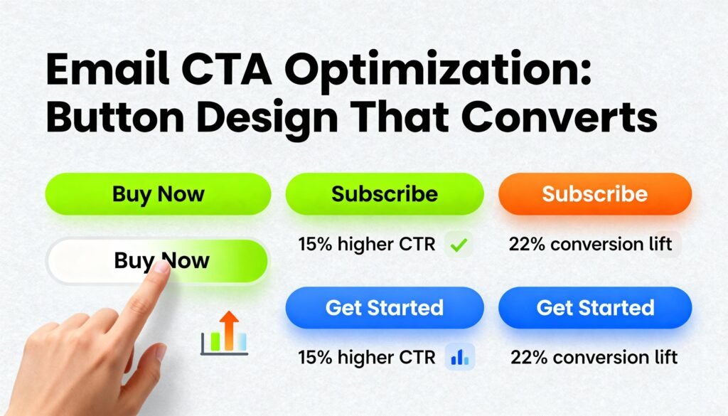
A/B Testing Your CTA Designs
When you A/B test your CTA designs, analyzing color impact and size effectiveness can lead to better results.
Try different colors to see which ones grab attention and drive clicks.
Similarly, experimenting with size can help you find the perfect balance between visibility and subtlety.
Color Impact Analysis
Color plays an essential role in the effectiveness of your call-to-action (CTA) buttons.
It can influence your audience’s emotions and decisions, much like how food perception affects cravings.
A/B testing different colors can help you find the perfect match for your brand.
Think about:
- Warm reds and oranges, evoking excitement and urgency
- Cool blues and greens, promoting calmness and trust
- Bold yellows, grabbing attention and sparking curiosity
- Soft pastels, creating a sense of comfort like art therapy
Experimenting with these colors can lead to improved engagement and conversion rates.
Remember, just as colors can change your mood, they can also alter your audience’s response to your CTAs.
Size Effectiveness Comparison
While color can greatly influence your audience’s response, the size of your CTA buttons also plays a vital role in grabbing attention and driving action. To find the ideal button size, you should conduct A/B testing, comparing different dimensions to see what resonates best. Think of it like packaging size effectiveness; just as larger packaging can stand out on a shelf, a bigger CTA button can draw more clicks. Below is a simple size effectiveness comparison:
| Button Size | Click Rate (%) | Audience Feedback |
| Small | 3% | Too subtle |
| Medium | 7% | Just right |
| Large | 15% | Eye-catching! |
| Extra Large | 10% | Overwhelming |
Experiment to discover what fits your audience best!
Best Practices for Mobile-Friendly CTA Buttons
How can you make sure your CTA buttons stand out on mobile devices?
It’s essential to focus on design and usability in mobile layouts.
Here are some best practices for creating mobile-friendly CTA buttons:
- Make it big: Use larger buttons that are easy to tap without frustration.
- Choose contrasting colors: Make sure your button pops against the background for visibility.
- Optimize for gestures: Design buttons that accommodate swipes and taps, enhancing user interaction.
- Place it wisely: Position your CTA where users naturally scroll, ideally above the fold.
Frequently Asked Questions
What Is the Ideal Placement for CTA Buttons in Emails?
You should place your CTA buttons in the header positioning of your emails. Eye tracking studies show that users naturally focus there first, increasing the likelihood they’ll engage and click your buttons effectively.
How Many CTA Buttons Should I Include in an Email?
You don’t want to overwhelm your readers with CTA volume, but having at least two buttons can enhance engagement. Maximum buttons should be three; this balance keeps your message clear and encourages action without confusion.
Should CTA Buttons Be Animated or Static?
You should consider animated CTA buttons for their animation impact, as they grab attention effectively. However, if your audience prefers simplicity, static buttons might resonate better. Test both options to see which drives more engagement.
How Often Should I Refresh My CTA Designs?
You should refresh your CTA designs every 6 to 12 months. Studies show 70% of users prefer updated visuals. Staying current with design trends and implementing refresh cycles keeps your audience engaged and motivated to click.
What Are Common Mistakes to Avoid With Email CTAS?
Avoid vague wording mistakes and make sure your CTAs are action-oriented. Don’t overlook personalization errors; tailoring your messages makes a difference. Test different phrases and designs to see what resonates best with your audience.
Conclusion
In the world of email marketing, your CTA buttons are like a lighthouse guiding ships safely to shore. By applying the principles of effective design, compelling copy, and strategic testing, you can turn those buttons into powerful conversion tools. Remember, it’s not just about getting clicks; it’s about creating a seamless experience that resonates with your audience. So, keep refining your approach, and watch your engagement soar as your CTAs lead to brighter shores of success.


