
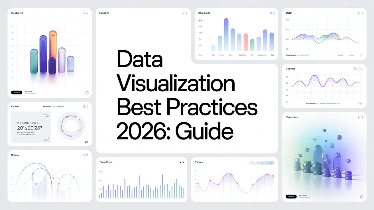


In 2026, data visualization best practices focus on deeply understanding your audience and choosing the right visuals to convey your message. Simplify complex data, utilize effective color schemes for readability, and incorporate interactive elements to enhance engagement. Consistency in design and style is key, along with regular testing and iteration to refine your visuals. By embracing these strategies, you create impactful narratives. There’s plenty more to explore to elevate your data storytelling!
Table of Contents
Key Takeaways
- Tailor visualizations to audience demographics and preferences to enhance engagement and comprehension.
- Choose the right visualization type, like bar charts for comparisons and line graphs for trends, to effectively communicate data stories.
- Utilize high contrast color schemes and consider color blindness to ensure readability and accurate interpretation of visuals.
- Incorporate interactive elements such as tooltips and filters to foster deeper exploration and engagement with the data.
- Maintain consistency in design through style guidelines and regular user feedback to refine and improve visual effectiveness.
Understanding Your Audience
How well do you really know your audience? Understanding your audience is essential for effective data visualization.
Start by analyzing audience demographics and segmenting them based on their information needs and target preferences. Use behavior analysis and user feedback to refine your engagement strategies.
Consider cultural considerations and how they shape communication styles; this will enhance your visual literacy. Tailoring your visuals to match your audience’s preferences not only captivates attention but also fosters understanding.
By aligning your content with their interests, you can create a more meaningful connection. Remember, the better you know your audience, the more impactful your visualizations will be. Additionally, leveraging user empowerment can significantly enhance your visual communication strategies.
Dive deep into their preferences and watch your engagement soar!
Choosing the Right Visualization Type
Selecting the right visualization type can make all the difference in conveying your message effectively. To do this, you need to evaluate your audience’s needs.
Different visualization types serve various purposes; for instance, bar charts excel at comparing categories, while line graphs show trends over time. If your audience craves clarity, opt for simple visuals like pie charts or infographics.
On the other hand, if they’re data-savvy, you might plunge into more complex visualizations like heat maps or scatter plots. Always align your choice with what best communicates your data story. Additionally, ensuring clear navigation can enhance user experience and help your audience find the insights they seek.
Simplifying Complex Data
When you’re faced with complex data, using clear visuals can make all the difference. Focus on prioritizing key information to guide your audience’s understanding. Additionally, utilizing search functionality can enhance user experience by helping them locate relevant content effectively.
Use Clear Visuals
Clear visuals are essential for making complex data accessible and understandable. When you create your visuals, focus on establishing a clear visual hierarchy. This means organizing elements so viewers can quickly grasp what’s important. Use size, color, and positioning to direct attention effectively.
Don’t underestimate the power of effective labeling; clear, concise labels help your audience interpret data accurately without confusion. Avoid cluttering your visuals with unnecessary information, which can overwhelm and distract. Instead, aim for simplicity that highlights key trends and insights.
Prioritize Key Information
Focusing on key information can make a significant difference in how your audience understands complex data. To effectively communicate your key message, you need to establish a clear data hierarchy.
Start by identifying the most important data points and organizing them in a way that guides your audience’s attention. Use larger fonts, bold colors, or contrasting visuals to emphasize these vital elements.
Avoid overwhelming your viewers with excessive details; instead, simplify your graphics, keeping only what’s necessary. This approach not only clarifies your message but also enhances retention.
Utilizing Color Effectively
When you’re creating data visualizations, color plays an essential role in conveying your message. Understanding color contrast can enhance readability, while color psychology can evoke specific emotions and responses from your audience. Additionally, incorporating analytics solutions can provide valuable insights into how your audience interacts with your visuals.
Let’s explore how to use color effectively to make your visuals stand out and resonate.
Color Contrast Importance
Although many people underestimate its impact, color contrast plays an essential role in effective data visualization. When you use high contrast combinations, it enhances readability and draws attention to key data points.
It’s vital to keep color blindness considerations in mind to guarantee everyone can interpret your visuals accurately.
- Prioritize clarity by using contrasting colors for text and backgrounds.
- Test your visuals against color blindness simulators.
- Use color palettes that accommodate various types of color blindness.
- Limit your color choices to avoid overwhelming viewers.
- Maintain consistent contrast throughout your visualizations for cohesion.
Color Psychology Insights
Color psychology plays an essential role in how your audience perceives and interacts with data visualizations. Understanding color meanings and their emotional responses can greatly enhance your message. For instance, reds often evoke urgency, while blues can instill trust.
Keep in mind cultural differences, as color associations vary widely; what symbolizes danger in one culture might represent prosperity in another. Aim for color harmony to create a balanced visual experience that draws your audience in.
Additionally, consider color symbolism to convey deeper messages; for example, green can symbolize growth. By being aware of the psychological impact of your color choices, you can effectively guide your audience’s visual perception and enhance their overall understanding of your data.
Incorporating Interactive Elements
Incorporating interactive elements into your data visualizations can greatly enhance user engagement, as it allows viewers to explore the data at their own pace. By integrating these features, you foster a more immersive experience that encourages interactive storytelling.
- Enable tooltips for detailed data insights.
- Use sliders for time-based data exploration.
- Implement filters to customize data views.
- Add clickable elements for deeper dives into specific datasets.
- Create animated shifts to illustrate changes over time.
These strategies not only grab attention but also empower users to manipulate the data, making it relevant to their interests. Additionally, ensuring visual simplicity in your designs can further enhance user experience and engagement.
Ultimately, this engagement leads to a richer understanding of the information you present, making your visualizations more impactful and memorable.
Ensuring Accessibility
Creating interactive data visualizations is just the start; ensuring accessibility takes your designs to the next level. You should prioritize screen reader compatibility, allowing visually impaired users to engage with your content. Use descriptive alt text for images and charts, ensuring that every element communicates its purpose effectively.
Incorporate a clear visual hierarchy to guide all users through your data. Use contrasting colors and distinct font sizes to highlight key information, making it easier for everyone to understand your message. Additionally, consider the importance of user experience disruption when designing your visualizations to ensure that all users can navigate your content seamlessly.
Balancing Aesthetics and Functionality
When creating data visualizations, you’ve got to strike a balance between visual appeal and clarity.
Color schemes can enhance your design, but they shouldn’t compromise readability.
Finding that sweet spot is key to effectively communicating your data.
Visual Appeal vs. Clarity
While it’s tempting to prioritize visual appeal in your data visualizations, clarity must remain the cornerstone of your design. Striking the right clarity balance guarantees your audience understands the information without getting distracted by unnecessary embellishments.
Here are some tips to help you achieve this:
- Use simple, clean layouts to enhance readability.
- Limit colors and fonts to maintain focus on the data.
- Prioritize essential information over decorative elements.
- Choose appropriate chart types that convey your message clearly.
- Test your designs with users to verify they effectively communicate the data.
Color Schemes and Readability
Choosing the right color scheme can greatly affect how easily your audience interprets data, as colors not only convey meaning but also influence readability. To enhance comprehension, consider color blindness considerations; using patterns or textures alongside color can help guarantee everyone understands your visuals.
Be mindful of cultural color meanings too—colors can carry different connotations across cultures. For instance, red might symbolize danger in some cultures while representing luck in others.
Aim for a balanced palette that maintains aesthetic appeal without sacrificing clarity. Utilize high contrast between text and background, and limit your color choices to avoid overwhelming your audience.
Providing Context and Insights
To effectively communicate data, you need to provide context and insights that transform raw numbers into meaningful information. Without context, your audience may struggle to grasp the significance of what they’re seeing.
Utilize contextual storytelling to create a narrative that connects your data points. Make insightful comparisons to highlight key trends and differences.
Here are some ways to enhance your data presentations:
- Frame data within relevant time periods
- Include benchmarks for comparison
- Use annotations to explain anomalies
- Relate findings to real-world implications
- Highlight connections to broader themes
Leveraging Narrative Techniques
Crafting a compelling narrative can elevate your data presentations by making them more relatable and engaging. Utilize storytelling techniques to create data-driven narratives that resonate with your audience.
Start with a strong hook to draw them in, then establish a clear narrative flow that guides them through the information. Incorporate emotional engagement by connecting data points to real-world impacts, fostering a deeper audience connection.
Visual storytelling enhances this experience, using charts and graphics to illustrate your engaging plots. Remember to create context-driven narratives to give your data meaning and relevance.
Maintaining Consistency
While you might be tempted to experiment with different styles and formats, maintaining consistency in your data visualizations is crucial for effective communication.
Visual consistency helps your audience quickly grasp the information you present. To accomplish this, follow these best practices:
- Establish style guidelines that define colors, fonts, and iconography standards.
- Guarantee brand alignment by using your organization’s colors and logos.
- Utilize templates for layout uniformity, making your visuals easily recognizable.
- Keep design coherence by applying the same data format and visual hierarchy across all visuals.
- Regularly review your font selection to maintain readability and professionalism.
Testing and Iterating Your Visuals
Testing and iterating your visuals is essential for ensuring they effectively convey your message. Start by gathering user feedback to understand how your audience interacts with your visuals.
Use various testing methods, such as A/B testing or surveys, to assess visual effectiveness and user engagement. Embrace an iterative design approach, creating multiple revision cycles that refine your work based on insights.
Conduct prototype evaluations to identify potential issues before finalizing your visuals. Track performance metrics, like click-through rates and time spent on visuals, to gauge success.
Tools and Software for Data Visualization
Choosing the right tools and software for data visualization can greatly enhance your ability to communicate insights effectively.
With so many options available, your software selection should align with your goals and audience needs. Here are some key considerations when exploring data visualization tools:
- User-friendliness: Opt for software that’s intuitive and easy to navigate.
- Integration capabilities: Confirm it works well with your existing data sources.
- Customization options: Look for tools that allow you to tailor visuals to your audience.
- Collaboration features: Choose software that supports teamwork and sharing.
- Cost-effectiveness: Balance your budget with the software’s capabilities.
Staying Updated With Trends
As you plunge into the world of data visualization, staying updated with current trends is essential for maintaining relevance and effectiveness in your presentations.
Engaging in regular trend analysis helps you identify emerging techniques and tools that can elevate your work. Follow industry leaders, join online communities, and subscribe to newsletters that focus on visualization innovations.
Attend webinars and conferences to see these trends in action, allowing you to gain insights from experts and peers alike.
Don’t shy away from experimenting with new styles or technologies; this adaptability can set you apart.
By continuously learning and implementing these trends, you’ll enhance your data storytelling and guarantee your visualizations resonate with your audience.
Stay curious and proactive!
Frequently Asked Questions
What Are the Latest Trends in Data Visualization for 2026?
In 2026, you’ll notice interactive dashboards becoming more prevalent, allowing real-time data manipulation. Augmented reality will also enhance visualizations, making complex data more accessible and immersive, transforming how you understand and interact with information.
How Do I Choose the Best Software for My Project?
Visualize your project’s needs like a painter choosing colors. Start with a software comparison, focusing on features that match your project requirements. Evaluate usability, integration, and support to guarantee your choice enhances your data storytelling.
Can I Use Animations in Data Visualizations?
Yes, you can use animation effects in data visualizations. They enhance user engagement by making your data more dynamic and easier to understand. Just guarantee the animations don’t distract from the key insights you want to convey.
What Are Common Mistakes to Avoid in Data Visualization?
Avoid common mistakes like chart clutter and color misuse, just as you wouldn’t cram too many ingredients into a recipe. Keep it simple and clear, ensuring your message shines without overwhelming your audience.
How Often Should I Update My Visualizations?
You should update your visualizations regularly, ideally every few months. This keeps your data relevant and guarantees your audience receives the most accurate insights. Adjust the update frequency based on changing data and audience needs.
Conclusion
Incorporating these data visualization best practices will elevate your work and engage your audience like never before. Did you know that visuals are processed 60,000 times faster than text? By understanding your audience, choosing the right visualization types, and using color effectively, you can make your data truly resonate. Remember, testing and iterating your visuals is essential for improvement. Stay curious and keep exploring new tools and trends to stay ahead in the dynamic world of data visualization!


